Social Media Content Creation, Strategy and Standards Guide for Restaurants
Restaurant Marketing, Social Media Standards, Creative Systems
Social Media Creative Standards for Restaurants: A Practical Guide for Facebook, Instagram, and Google Business Profile
As restaurant marketers, we are no longer just “posting content.” We are designing a mobile-first, always-on brand experience that has to stop the scroll, feel unmistakably like us, and convert attention into covers, orders, and events. This guide from Target Stream Media Inc. walks through how to build practical, repeatable creative standards and design guides for Facebook, Instagram, and Google Business Profile that do exactly that.
Why Restaurant Social Media Needs Formal Creative Standards Now
Most restaurants are already posting frequently. The gap is not activity; it is consistency and clarity. Without defined standards, feeds drift: every designer, photographer, or manager posts a slightly different look, and your brand becomes harder to recognize in a three-second mobile scroll. That inconsistency quietly erodes recall, trust, and response rates over time.
Target Stream Media’s work across independent restaurants and multi-unit groups shows a repeatable pattern: when creative standards are documented, enforced, and tuned to mobile behavior, restaurants see stronger engagement, higher offer redemption, and more efficient paid media performance. The goal is not to lock creativity into a rigid template. It is to give your team a shared operating system for how the brand behaves on Facebook, Instagram, and Google Business Profile (GBP).
Maintain a Recognizable Visual Identity While Redesigning for Mobile Social
Restaurant brands are often built first for menus, signage, and websites. Social media is where that identity must compress into a two-second impression on a four-inch screen. The challenge is to translate your visual identity, not replace it. Your logo, color palette, and core typography should remain familiar, but how they show up on mobile needs to evolve for legibility and speed of understanding.
Logo behavior: Use a simplified, high-contrast logo lockup for avatars and corner bugs. Avoid thin lines and intricate marks that disappear at small sizes.
Color system: Keep one to two primary brand colors on social (for this guide, think fresh aqua accents) and reserve the full palette for long-form assets like menus and websites. On mobile, fewer colors equal faster recognition and better accessibility control.
Type system: Use your primary brand typeface for headlines where legible, but allow a social-safe alternate (e.g., a clean, geometric sans-serif) for small on-artwork copy to preserve readability.
💡 Strategic Note: Your goal is that a guest recognizes a post as “you” before they see your handle. That recognition is built through consistent color, composition, type, and subject matter, not through heavy logos on every frame.
Core Creative Principles: Stop the Scroll, Say Less on the Artwork, Show What Matters
1. Design to “Stop the Scroll”
On Meta platforms, most restaurant impressions are passive: your post appears between a friend’s vacation photo and a Reel. Your first job is not to explain everything. It is to create a moment that makes someone pause long enough to care. That means:
Strong focal points (one hero pizza slice, one musician, one bartender pouring a cocktail) instead of busy collages.
Clear contrast between subject and background so the eye knows where to land in under a second.
Motion where possible: steam rising, cheese pull, a musician’s hand in motion. Even in stills, capture implied movement.
2. Reduce On‑Artwork Copy, Increase Visual Priority of What Counts
For restaurant posts, most information should live in the caption, not on the photo. On-artwork text should be reserved for the one or two elements that must be understood instantly: the offer name, the day, and sometimes the time. Everything else—menu details, RSVP links, parking notes—belongs in the caption or on the landing page.
Good: “Pizza Tuesday” + “Half-Price Slices” on the image; full terms and hours in the caption.
Poor: Full menu list, disclaimers, and address squeezed into tiny text on the artwork.
📌 Key Takeaway: If a guest cannot read your on-image copy at arm’s length on a phone, you have too much text or too small a hierarchy.
3. Let Food, People, Musicians, and Environment Carry the Story
The strongest restaurant posts are not graphic design pieces; they are moments. Your creative standards should explicitly state that photography of food, guests, staff, and performers is the primary storytelling vehicle. Design elements exist to frame and clarify, not to compete with the subject.
For food: tight close‑ups, clear textures, and natural lighting that makes dishes look craveable, not over‑filtered.
For people: genuine expressions, staff at work, guests laughing, musicians mid‑set. Avoid staged, empty-room shots as your only imagery.
For environment: capture the atmosphere—lighting, decor, bar setup, patio energy—so guests can imagine themselves there.
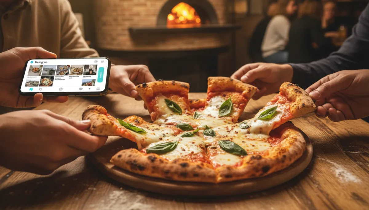
Close-up of a wood-fired pizza on a table with hands reaching in, smartphone on the side showing...
Let the food and real guest moments lead; design should amplify, not overshadow.
Platform-Specific Resolution and Composition Standards
Meta and Google continue to refine formats, but some principles are stable. Always confirm current specs in official documentation—Meta’s Business Help Center (facebook.com/business/help) and Instagram’s business resources (about.instagram.com)—but build your guide around these baseline standards:
Facebook & Instagram
Feed posts (preferred): 1080 × 1350 px (4:5 vertical). This format fills more of the phone screen and supports “stop the scroll” behavior more effectively than square alone.
Secondary feed: 1080 × 1080 px (1:1 square) for grid consistency on Instagram when needed—use sparingly for key evergreen tiles or pattern breaks in your feed design.
Stories & Reels covers: 1080 × 1920 px (9:16). Keep critical text and faces within the central 1080 × 1420 “safe zone” to avoid cropping behind UI elements and profile icons.
Google Business Profile (GBP)
Google recommends high-resolution images in a 4:3 or 16:9 aspect ratio, with a minimum of 720 × 720 px for square formats and JPG/PNG at good quality (support.google.com/business/answer/3038177). For restaurants, we recommend:
1200 × 900 px (4:3 landscape) for interior, exterior, and food shots. This displays well across desktop and mobile search and map views.
Ensure your logo and cover photo are crisp, centered, and on-brand; GBP is often the first brand touchpoint before social.
💡 Pro Tip: In your standards, define one “master” resolution (e.g., 2160 × 2700 px for 4:5) and scale down versions for each platform. This keeps cropping predictable and simplifies production.
Accessibility and Contrast: Applying WCAG 2.2 AA to Restaurant Creative
Accessibility is not just a compliance box; it is a performance advantage. Posts that are easy to read and understand perform better with all audiences. In 2026, WCAG 2.2 Level AA is the most current standard for formal conformance (w3.org). While platforms themselves are not required to conform, your content should follow these principles wherever tools allow:
Contrast: For normal-sized text on artwork, aim for at least a 4.5:1 contrast ratio between text and background; for large text (18 pt+ or 14 pt bold+), at least 3:1. When using fresh aqua or brand blues, test combinations against dark backgrounds to maintain AA contrast.
Alt text: Use platform tools to add alt text to images on Facebook, Instagram, and GBP. Describe the key information, not every pixel: “Close-up of pepperoni pizza slice with cheese pull promoting Pizza Tuesday special” is more useful than “Photo of food.”
Captions: For videos and Reels, include captions or burned-in subtitles with accessible contrast. WCAG 2.2 encourages accessible media alternatives (w3.org – social media accessibility).
U.S. guidance under ADA and Section 504 increasingly expects public-facing entities to align with WCAG 2.1–2.2 AA for web and mobile content (ada.gov). While many restaurants are not government entities, designing to this standard future‑proofs your content and protects brand reputation.
Best Practices for Photography and Visual Storytelling in Restaurants
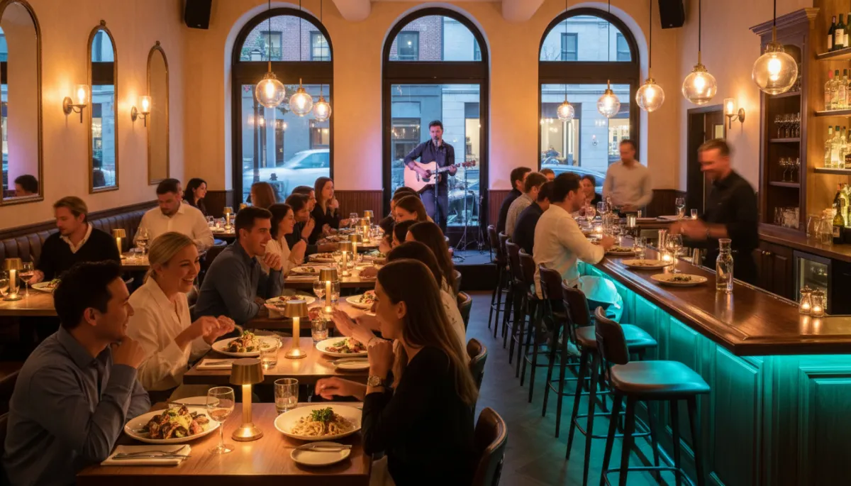
Interior of a lively restaurant during dinner service, lighting, diverse guests enjoying food,...
Capture the real energy of service; guests respond to authentic, in-the-moment scenes.
Visual Direction for Food
Shoot at 45° or overhead for flat dishes; use side angles for burgers, cocktails, and layered items where height matters.
Use diffused natural light where possible; avoid harsh flash. Keep color true to life and consistent across sessions so dishes look like what guests receive.
Maintain a consistent backdrop set: one wooden table, one marble, one darker bar top. This becomes part of your visual identity.
Visual Direction for People and Events
Prioritize candid interactions—cheers, shared plates, servers in motion. Secure releases where required, especially for paid campaigns and minors.
For musicians, capture close-ups of instruments, hands, and facial expressions, plus one or two wide shots showing crowd and environment to communicate scale and vibe.
Story Arcs, Not One-Off Shots
Build your content library around narrative arcs: prep, service, and aftermath; before, during, and after an event; raw ingredients to finished dish. This gives you flexibility to build carousels, Reels, and Stories that feel cohesive rather than random.
Campaign Creative Direction: Pizza Tuesday
Visual Concept
Objective: Make “Pizza Tuesday” as recognizable as a weekly TV show. Every asset should be instantly associated with the offer, even when seen briefly in a crowded feed. Define:
A consistent hero angle (e.g., overhead of a full pizza with one slice pulled, fresh aqua accent in napkins or plates).
A fixed color treatment: warm food tones with a fresh aqua overlay bar or badge used only for Pizza Tuesday posts.
Copy Hierarchy for Pizza Tuesday
On Artwork – Level 1: “Pizza Tuesday” (campaign name, always in the same position and type style).
On Artwork – Level 2: Core value prop, e.g., “Half‑Price Slices” or “Buy 1, Get 1 Free.” Keep this to one short line with high contrast.
Caption: Details: hours, dine‑in vs. takeout, reservation link, menu callouts, and clear CTA (“Reserve your table” or “Order online now”).
Typography Standards for Pizza Tuesday
Headline font: bold, sans-serif, upper- or title-case only; minimum 60–80 px on a 1080 × 1350 canvas for legibility in mobile feeds.
Secondary line: same font family, lighter weight or smaller size; no more than 5–6 words.
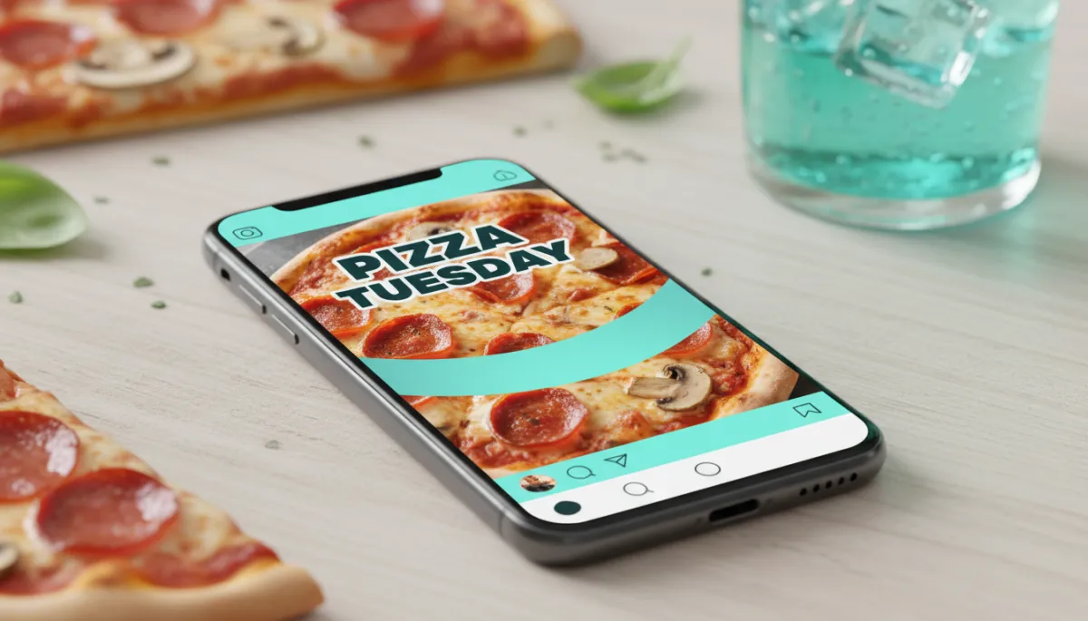
Marketing mockup showing a Pizza Tuesday Instagram post on a smartphone screen, with a bold...
Name the campaign, show the food, and keep the on-image message ruthlessly simple.
Campaign Creative Direction: Live Music Nights
Visual Concept
Objective: Sell the experience, not just the act of “live music.” Guests should feel the room, not read a flyer. Build a system where:
Each Live Music post uses a consistent framing: musician in the foreground, bar or crowd softly visible behind, with subtle fresh aqua lighting or graphics tying the series together.
You capture one clean, high-contrast portrait of each performer to use across GBP, Facebook events, and Instagram posts.
Copy Hierarchy for Live Music
On Artwork – Level 1: “Live Music” or your named series (“Friday Sessions,” “Acoustic Nights”) in a consistent type lockup.
On Artwork – Level 2: Artist name + day only, e.g., “Mia Torres – Friday.” Time and cover details move to the caption and event description.
Caption: Genre, vibe, booking link, and one line about food/drink pairings (“Start with our mezcal margarita before the first set.”).
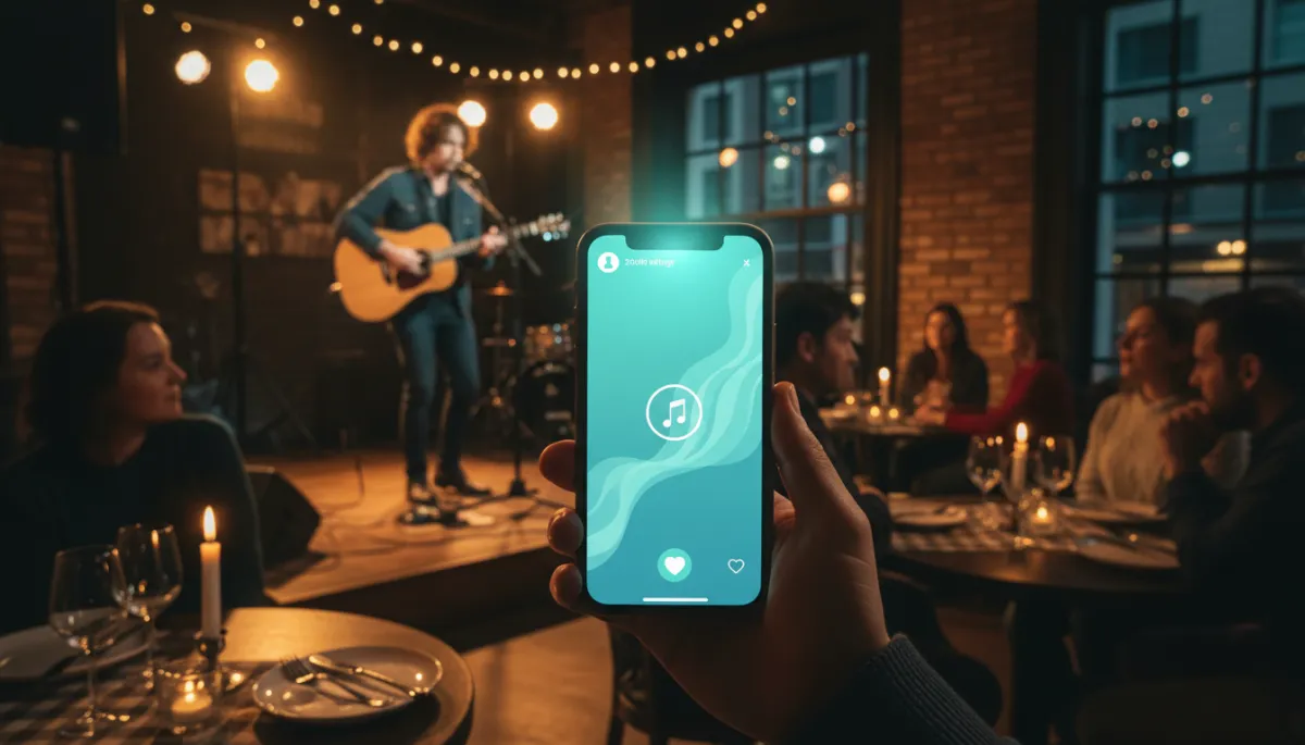
Scene of a guitarist performing on a small restaurant stage with guests at tables, a phone in...
For live music, lead with atmosphere and artist presence; details live in the caption.
Recommended Copy Hierarchies and Typography Standards Across Channels
On-Artwork Copy Hierarchy (Universal)
Primary Message: Campaign or offer name (“Pizza Tuesday,” “Live Music,” “Brunch All Weekend”). One line, largest type, strongest contrast.
Secondary Message: One supporting detail (discount, day, or simple benefit). Smaller but clearly subordinate in size and weight.
No Tertiary Paragraphs: If you feel tempted to add a third block of text, move it to the caption.
Typography Standards
Limit yourself to one primary display font and one supporting body font for all social artwork. This keeps production simpler and brand recall higher.
Define minimum font sizes for each format (e.g., 42 px minimum for secondary text on 1080 × 1350) and include them in your guide to avoid illegible tiny type.
💡 Pro Tip: Print a few posts at 2 × 3 inches and review them at arm’s length. If copy is hard to read on paper, it will be worse on a moving mobile feed.
Designing a Strategic Social Content Mix for Restaurants
Creative standards are most powerful when paired with a defined content mix. For most restaurants, Target Stream Media recommends a monthly mix that balances demand generation (offers and events) with brand building and community storytelling:
30–40% Offers & Promotions: Pizza Tuesday, happy hour, seasonal menus, holiday events. High clarity, strong CTAs, designed to convert.
30–40% Brand & Experience: behind-the-scenes prep, chef stories, live music, guest experiences, sustainability efforts—aligned with trends highlighted by Forbes and QSR on storytelling and values-based marketing (Forbes 2023 strategies).
20–30% Community & UGC: reposted guest photos, local partnerships, staff spotlights, cause marketing. Encourage branded hashtags and geo‑tagging to support local SEO, as recommended in current restaurant marketing best practices.
Your design guide should specify how each category looks: what framing, color usage, and copy hierarchy define an “offer” post versus a “brand story” post. This makes it easier for internal teams or agency partners to build content that feels cohesive even when produced by different people.
Building a Consistent Production System: File Sizes, Naming, and Workflow
Efficient File Sizing
Overly large files slow upload, reduce responsiveness on weaker connections, and can be throttled by platforms. Under‑compressed files look soft or artifacted. As a baseline:
Export JPGs for photo-heavy posts in the 200–400 KB range at 1080 px width for Meta, with high-quality compression (80–90%).
Use PNG only when transparency or sharp graphic edges are required; otherwise prefer JPG for faster loading.
Naming Conventions That Scale
Clear file naming is a small operational decision that saves hours across a year and makes AI-powered media management far more effective. A simple, consistent pattern might be:
2026-03_pizza-tuesday_feed-4x5_half-price-slices_v01.jpg
2026-03_live-music_fri-mia-torres_story-9x16_v02.jpg
2026-03_gbp_interior-diningroom_1200x900_v01.jpg
Include at minimum: date or month, campaign, platform/format, and version. When Target Stream Media connects this library into an AI-enabled Media Tool Kit or agent workflow, these patterns make it trivial to retrieve the right asset automatically.
Systematizing Production
Maintain a shared folder structure by campaign and month (e.g., “2026_03_PizzaTuesday/Final_4x5/”).
Keep editable masters (PSD, AI, or design tool files) separate from exports, with locked style layers for logos, typography, and color overlays.
💡 Partner Perspective: When Target Stream Media steps into an existing restaurant marketing operation, the fastest performance gains often come from tightening these production systems—not from adding more content. Consistency is a growth lever.
Referencing Official Platform and Accessibility Documentation
Because formats and policies evolve, your creative standards should include a “living” references section with links and review cadence. At minimum, include:
Meta Business Help Center for Facebook and Instagram specs and ad policies: facebook.com/business/help and Instagram announcements at about.instagram.com.
Google Business Profile image and post guidelines: support.google.com/business/answer/3038177.
WCAG 2.2 guidelines from W3C for accessibility standards: w3.org/WAI/standards-guidelines/wcag/.
Assign a quarterly review to confirm that your resolution, file type, and accessibility assumptions remain aligned with current guidance. This is a simple governance habit that prevents last-minute redesigns when platforms roll out changes.
Final Creative QA Checklist for Restaurant Social Media
Before any Pizza Tuesday promo, Live Music announcement, or seasonal campaign goes live, run it through a short, disciplined QA. This is where strategy, design, and operations converge. Use this checklist as the last step in your workflow:
1. Brand & Visual Identity
Does the post look unmistakably like your restaurant at a glance (color, composition, subject matter) without relying on a large logo?
Are brand colors used consistently and sparingly, with fresh aqua or your primary accent reserved for key elements?
2. “Stop the Scroll” & Copy Discipline
Is there one clear focal point (hero dish, person, or environment) that reads instantly on a phone?
Is on-artwork copy limited to primary and secondary messages only, with all other details in the caption?
3. Platform & Technical Standards
Is the resolution correct for the intended placement (4:5 for feed, 9:16 for Stories/Reels, 4:3 or square for GBP)?
Are key elements within safe zones, avoiding UI overlays and cropping across devices?
4. Accessibility & Contrast (WCAG 2.2 AA Aligned)
Does text on the artwork meet at least 4.5:1 contrast for normal text or 3:1 for large text, especially when using light brand colors?
Have you added alt text and, where relevant, captions or subtitles for video content?
5. Production & Naming
Is the exported file within your target size range and saved in the correct folder for future reuse and reporting?
Does the file name follow your agreed convention, including date, campaign, platform, and version?
6. Strategic Outcome Alignment
Is the CTA clear and aligned to a measurable outcome—covers, reservations, orders, or event attendance?
Does this post fit your planned content mix for the week or month, or is it an off-strategy one-off?
When you treat creative standards as a living system—not a static PDF—you give your restaurant brand the ability to show up consistently, accessibly, and persuasively across Facebook, Instagram, and Google Business Profile. That consistency is what lets AI tools, media platforms, and your own team do their best work. If you are ready to formalize your standards, integrate them into a production-ready system, or connect them to Agentic AI that can help manage your front desk and marketing execution, Target Stream Media Inc. is built to be that partner.
Schedule your free AI strategy session, see what an AI-powered media toolkit looks like for your restaurant, and start turning your social creative into a growth system—not just a feed.
